Creating Luce and the Rock | The process behind the short film
Did you ever wonder how a Short Film is made?
TVPaint has been so lucky to have the “Luce and the Rock” director and team telling us all about how they made this piece of art.
Project and Style Development
With Britt Raes, author and director
The very first ideas for the characters and the backgrounds were drawn with pencil on paper. Development and research began with basic materials. I like the simplicity of it. It’s a very accessible way to start, without any risk of encountering technical issues.
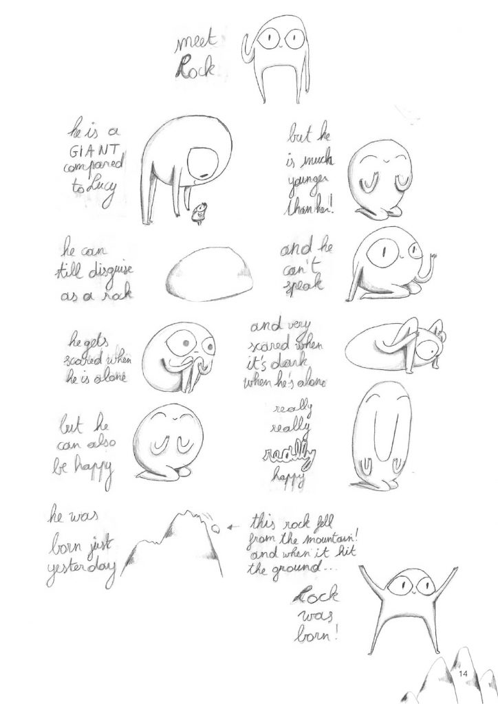 | 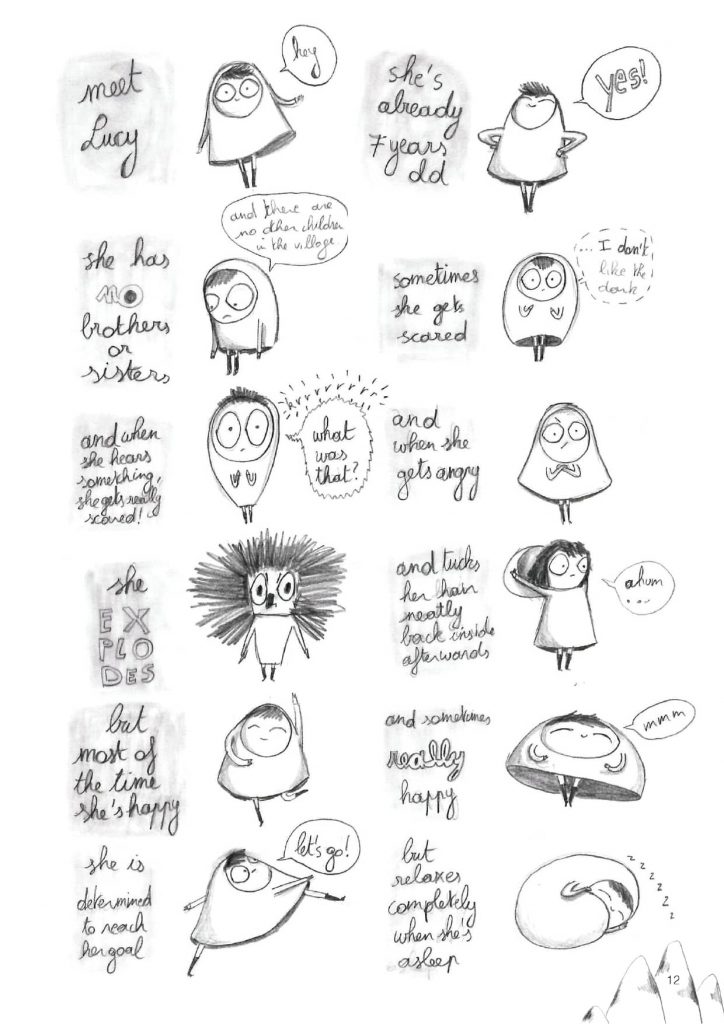 |
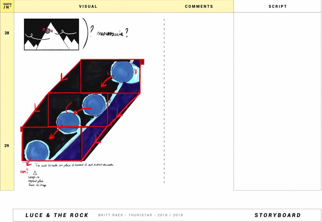
The same goes for the storyboard: the first version of it consisted of sketches made on paper with a simple pencil.
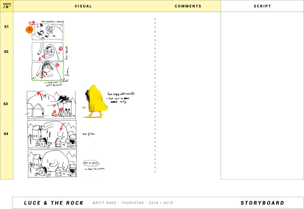
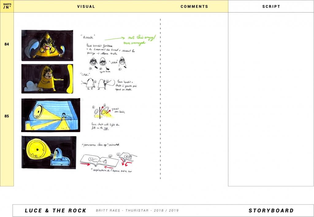
The next step consisted in further developing the designs using Procreate and Photoshop. With an Apple tablet and a Cintiq, we drew many versions of the characters to figure out the perfect shapes and colors. These elements are very symbolic in the film, representing who is connected to who, and who belongs where so that the characters literally ‘fit in’. To create this strong visual identity, we relied on basic shapes and colors: circles, squares, triangles, blues, reds, and yellows.
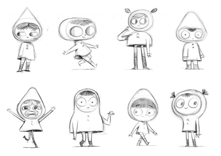 | 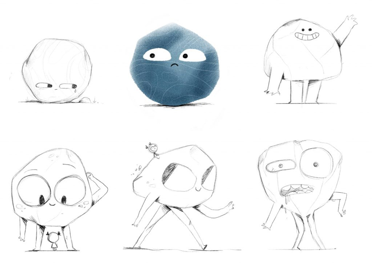 |
At first, when developing the characters, we kept adding details to give them their own identity (like buttons, or a bow…) but in the end, I decided to take all of these details away to focus on basic shapes. I wanted the characters to be ‘simple’, to give as much room as possible to the animators to play with them. Hence why for the next step, animation, we chose to produce the film using TVPaint: it allowed the animators to draw quite intuitively.
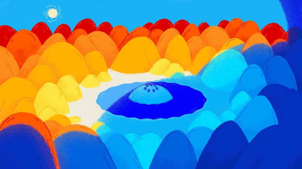
As for the backgrounds, we went through a long process of adding things and then removing elements to get to the core of the style of the film. I myself have an illustration background and love to think about composition and symmetry. The backgrounds look quite simple, but this means every element has to be drawn ‘right’, otherwise, it falls out of tune. There is nowhere to hide. The backgrounds change a little throughout the film, so we had to make different versions of them (like the village: first in its ‘normal’ version, then broken partially, then with all houses broken, and then with the houses fixed).
We also had to make different versions of the backgrounds to prepare the post-production implementation of light and darkness. To make sure the colors looked exactly like we wanted them to and have control over the look and texture of the backgrounds, we created both dark and light versions of the backgrounds in advance. In post-production, an animated mask was then used.
The first version of the storyboard was drawn with pencil on paper, but the next one was drawn digitally, in order to create the animatic. At this moment, we also started adding temporary music and sound effects. At first, we used reference music to inspire the composer of the film, Bram Meindersma. During that stage, he started creating the musical score. The rhythm of the music and the film go hand in hand, and several sound effects became musical elements. The base of the music was already composed when we started working on the animation, so the animators could be inspired by the rhythm of the music. During that stage, there was a back-and-forth with the composer, so the animation and music took shape together.
The voices of the villagers in the movie were recorded by the music composer, as their vocal sounds (like their “good mornings”, crying or yawning) sometimes became part of the music. The recording of the voices of Luce and Mom was recorded in a more traditional way, separately. The main voice actors are members of my family: my niece Fien, my nephew Casper and their mother Karolien. It was a challenge to record their voices as they don’t have any professional experience. At the time of the recording, Fien and Casper were 6 and 9 years old. Because of the restrictions during the pandemic, the recording could not happen in a professional studio, so it took place in the attic of their home. Fien, Casper, and Karolien are the original voices (for the English version), and they also did the Dutch/Flemish version of the film. The animation was created based on the English voices because the short film would travel to film festivals everywhere around the world! The French version of the film was recorded as dubbing, after the film was finished.
Animation
With David Chambolle, Lead animator
The animation process itself is quite classic traditional animation. At first, we mainly relied on key poses to lock the animation (the “WHAT”, what the character does), then the breakdowns (the “HOW” he does what he does).
By playing both with the SPACING (gap between the elements from one DRAWING to another) and the TIMING (the number of frames for which the drawing remains on the screen), we found the rhythm that we thought was in line with the intention of the shot, and we finished with the IN BETWEENS (the drawings that fluidify the animation, to give the human eye the illusion of a continuous movement). All in all, it was a pretty typical process:
Initial pose / Lowers herself a little / Anticipation: We lower Luce in order to give more impact to the main movement, which is an ascent / Major ascent: Luce rises by 70% for a more dynamic and energetic movement / Final pose.

CLEAN & COLOUR | Part 1
For the clean, I didn’t know the CTG layer (Colour and Texture Generator Layer) at the time, which would have made coloring a little more effective to be honest 🙂
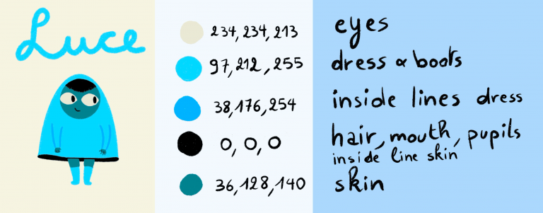
But we proceeded anyway, with a system of shaping and masks to create these silhouettes. That’s the main principle we relied on. We created masks from biggest to smallest (whole body, then by surface size: skin, eyes, hair, etc.), each layer consisting of an element of a specific color.
From the background, we created a mask that did not fill in what was « above » it (the layers above). The result was a silhouette that we completed so that it extended to all the features of the character: this allowed us to make BOTH the color AND the lineart in color, directly, without having to color the lineart during the cleaning step.
The clean, a classic clean | 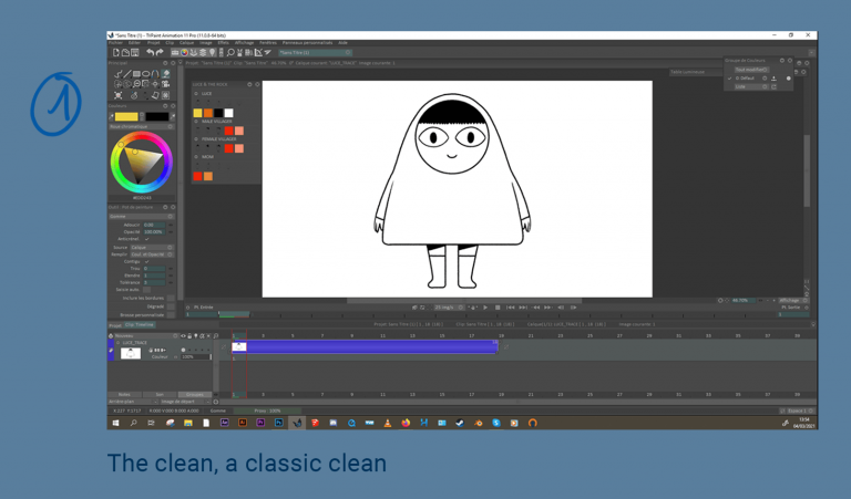 |
The colorized background with the “on top” function: it leaves a silhouette-shaped hole on the image because since the clean’s lineart is closed, the color can’t enter the zone. | 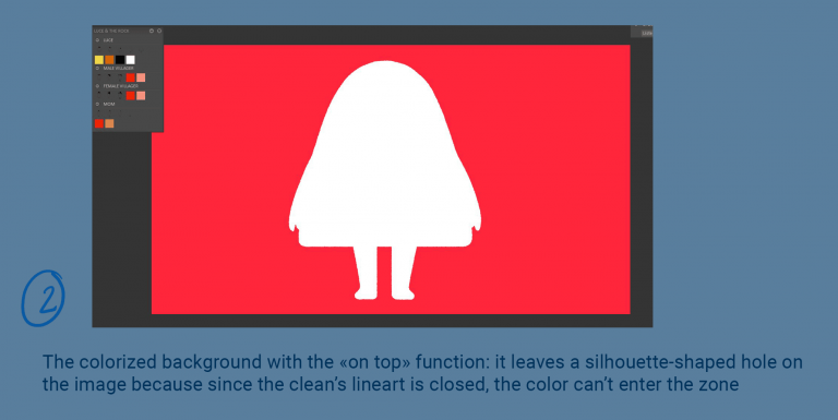 |
We color with the lasso tool, with the background as a mask | 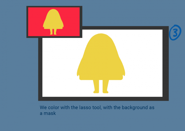 |
This step is completed by filling the lineart with the lasso tool, using the clean layer as a mask | 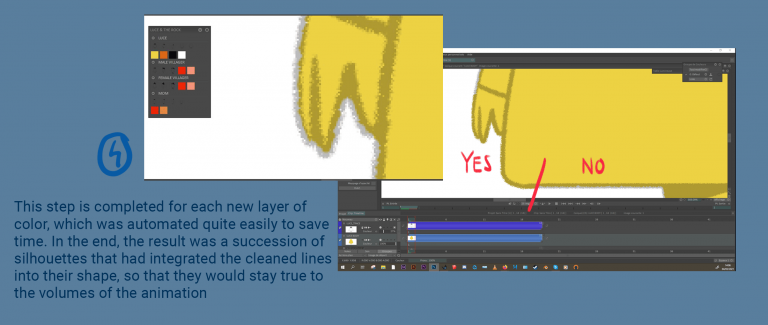 |
CLEAN & COLOUR | part 2
We repeated this operation for each new layer of color, which was automated quite easily to save time. In the end, the result was a succession of silhouettes that had integrated the cleaned lines into their shape, so that they would stay true to the volumes of the animation.
The features such as the pupils/hair/mouth being often cleaned directly on a separate layer, the only thing left to do was to erase or mask the initial clean to have the finalized character. At times, we had to complete/correct some holes or some graphic gaps by hand, in the traditional way, but overall, this is how it worked. We left the masks in our layers under the name of FILL layer, so they could be used directly as masks for compositing if needed (although with the shape of the body parts, the masks were, by nature, already present, but it saved a few steps in compositing).
Post-Production
With Raf Schoenmaekers, Compositing
For post-production and final compositing, the animations – created in TVPaint – were exported as Photoshop sequences. The character animations were split in 2 layers: the outline and the fill color. Keeping them all separate allowed for separate treatment in post-production as well as easy placement in the set, behind or in front of the different elements making up these sets: houses, rocks, doors, etc.
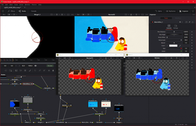 | 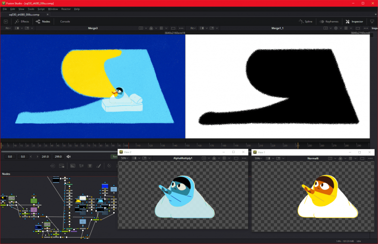 |
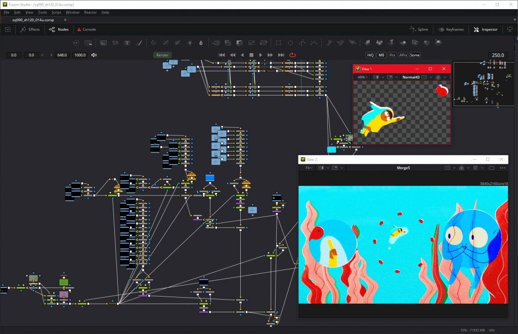
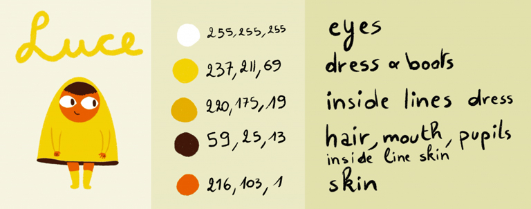
Additionally, as light plays an important role in the film, most of the sets included an (animated) mask layer to separate light and dark parts of the frame. The base colors applied in TVPaint (both for outline and fill color) were those of the ‘light/day’ versions of the characters.
 |  |
The Blackmagic Fusion was used for compositing and once style and look were decided upon, the pipeline for every shot roughly followed these steps:
- A script imports the Photoshop sequence and layers them according to the TVPaint setup.
- The corresponding set (which often has a ‘light’ and ‘dark’ version) is added.
- The characters are ‘recolored’ using custom tools, as the colors were very specific and needed more than just a « hue-shift ».
- Edge distortion and particle effects are applied to the light/dark mask separating day from night, to make it less clean and somewhat ‘alive’.
- Day and night versions of the characters are combined using this mask and additional edge effects are added. A somewhat loose riso(graph) effect is also applied to make characters look less clean and stand out.
- Characters and sets are layered and combined, again respecting the proper light/dark masking
- Additional particle effects are added and applied, using Fusion’s native particle system
- Some final grading is applied
All in all, there are no spectacular effects involved in this film, but masks and elements being used, reworked, and reused. A node-based compositing tool was indispensable to keep an overview and full creative flexibility within the pipeline and to process the hundreds of shots of this nifty movie.
Check out Luce and the Rock trailer.


